
The story worth telling
Fish Catch is a fast-casual seafood spot in Inglewood, California. The owner asked me to lead the creative for the whole brand: the logo, the menu, the food photography and everything printed or posted.
The brief was simple and hard at the same time. It had to feel soulful, flavorful and rooted in the neighborhood. It had to speak to local families and young professionals, stay easy to read at the counter, and be ready to grow.
Putting the family in the brand
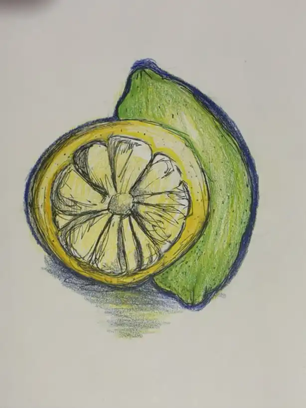
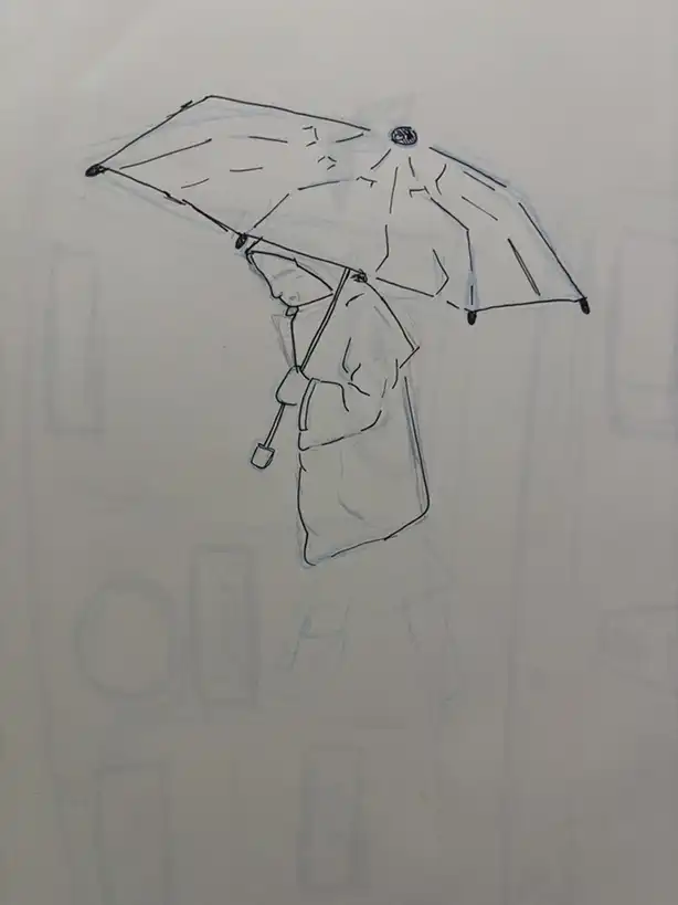
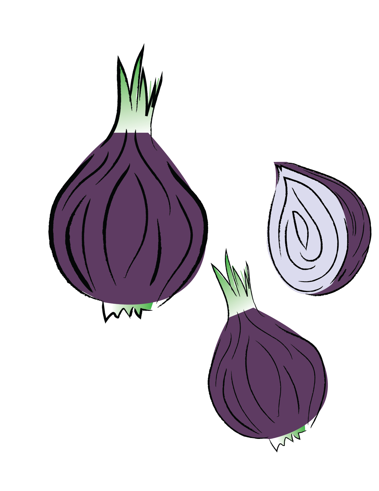
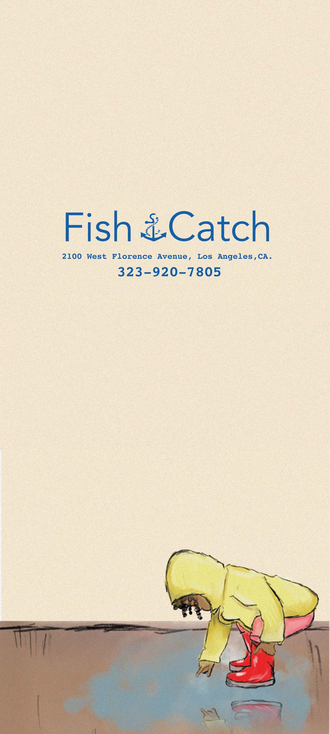
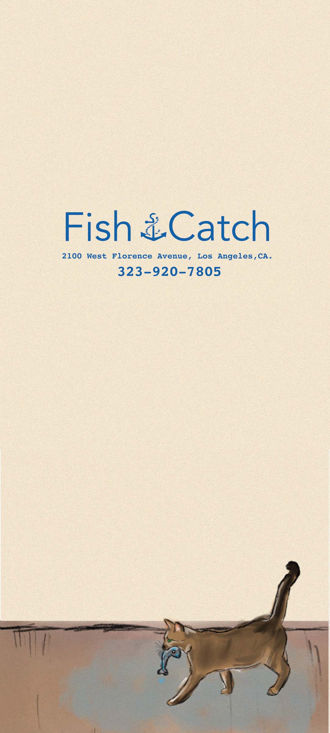
I didn’t want a generic seafood logo. The owner’s own people became the brand: I illustrated his son, his daughter and the family cat, and set them next to the ingredients from the menu: shrimp, lemons, herbs and spices.
Those drawings became the visual language for everything after: menus, signage and the graphics around them. Every piece feels like it belongs to this restaurant and nobody else.


The illustration set









One palette, every surface
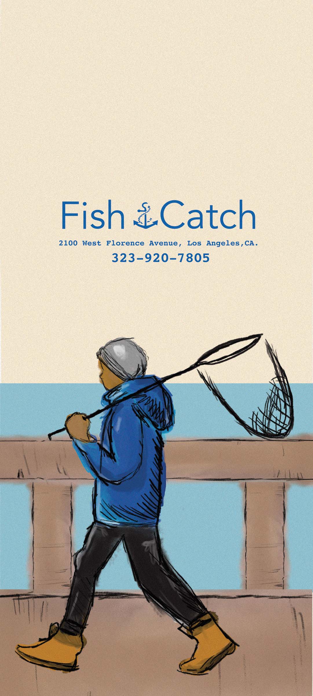
The colors come straight from seafood and Southern cooking: golden yellows, deep navy and warm wood tones. I used them the same way on the printed menus, the wall art and the logo system, so the brand reads as one thing from the sign outside to the box in your hand.


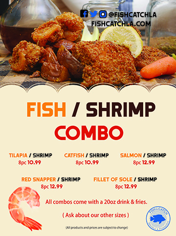
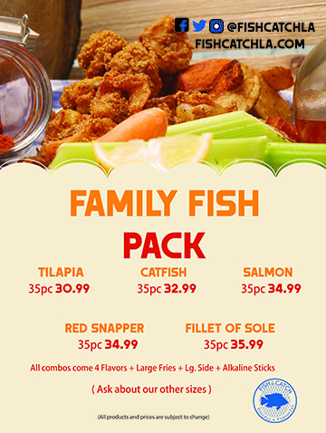
Menus + promos
What it did
Fish Catch walked away with one clear identity across the store and online. Customers took to it, and the place started to feel like a local favorite instead of a quick bite.
The system still runs the day-to-day: promos, social posts and new menu items all come out of it, and it gives the business a framework to grow into.


